
The Four Evangelists
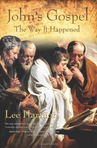
The picture on the right is the proposed cover of my new book, John’s Gospel: The Way It Happened. I’ll give you the scoop on the artwork, if you’ll tell me what you think!
“The Four Evangelists,” by the 17th century Flemish artist Jacob Jordaens, presumably depicts the authors of our four Gospels: Matthew, Mark, Luke and John. Many think the four evangelists are portrayed left-to-right in the same order as the Gospels, and point to this mysterious verse in Mark to identify the boy:
A young man, wearing nothing but a linen garment, was following Jesus. When they seized him, he fled naked, leaving his garment behind. –Mark 14:51-52.
But was Mark really writing about himself? Could the lad in these verses be young John the Apostle, with his trademark angelic face and curly hair? John is universally thought to be the youngest of the Twelve. Is Jordaens hiding a secret unshared, by wrapping John in a white linen?
The story continues in Mark with Peter following from a distance, but the Gospel of John tells a different story: A second unnamed disciple follows Jesus with Peter. This mystery disciple is thought by most to be John the Apostle. Might it also be the same lad who fled, leaving his outer garment?
A few days later in Mark’s story, a young man dressed in a white robe sits outside the tomb, informing visitors that Jesus has risen. Is this young man Mark? John? An angel, as depicted in later Gospel tradition?
Adding to the mystique of the painting is the dispute over whether it was titled “The Four Evangelists” at all. Some art historians argue that the lad is simply too young to be one of the evangelists. Also, he appears to wear what may be a prayer shawl, as may have been worn in the Temple, rather than a “linen garment.” These historians therefore identify the painting as “Jesus Among the Sages,” a depiction of the twelve-year-old Jesus conversing with the teachers in the Jerusalem Temple (see Luke 2:46-47).
The mystery remains. Since my book encourages us to embrace mystery and ambiguity in the scripture, I fell in love with the painting as a cover theme.
(heh – editorial note: The picture has been reversed for the book cover, so they are no longer Matthew/Mark/Luke/John from “left to right” but “right to left”.)
4 Comments
Leave a Reply to Dave Bleja Cancel reply
Fantasy Football, Anyone?
The River of Life
 Twice before Lee Harmon has written about Christian topics, once on the gospel of John and once on the book of Revelation. But the question people keep asking him is this: As a liberal Christian, why do you care so much about the Bible? Others wonder whether he is truly a Christian at all.
The Way It Happened

|

|
| Revelation: A love story gone awry. | The Gospel: A love story set aright. |
What really happened 2,000 years ago? How did a persecuted minority of end-time believers known as Christians, with their dreams of Armageddon and a conquering Messiah named Jesus, evolve into the largest religion in the world? Author Lee Harmon explores the period in which the New Testament was written in his books about John's Gospel and Revelation.
(Bloggers: you may be eligible for a free review copy! Just contact us.)
Connect With Me!
A Top-100 Christian Blog
 Named an Exceptional Website for Christian Theologians
Our Top Book Picks


Selected by The Dubious Disciple as Best Religion Books. Don't miss these!
Subscribers:
 Twitter Followers
 Facebook Fans
 16806 Blog Members
 354 Circles
 603 Goodreads Friends & Fans
The God Show
 Lee Harmon interviewed on The God Show about the History Channel's miniseries The Bible and Lee's latest book, John's Gospel: The Way It Happened.
About Lee
 Hello! I'm an author, historical Jesus scholar, book reviewer, and liberal Christian, which means I appreciate and attempt to exercise the humanitarian teachings of Jesus without getting hung up on any particular supernatural or religious beliefs.
The Bible is a magnificent book that has inspired and spiritually fed generations for thousands of years, and each new century seems to bring a deeper understanding of life’s purpose. This is true of not only Christianity; through the years, our age-old religions are slowly transforming from superstitious rituals into humanitarian philosophies. In short, we are growing up, and I am thrilled to be riding the wave.
I avidly read all thought-provoking religion titles. New authors: I'd love to read and review your book!
Contact me here.
Hello! I'm an author, historical Jesus scholar, book reviewer, and liberal Christian, which means I appreciate and attempt to exercise the humanitarian teachings of Jesus without getting hung up on any particular supernatural or religious beliefs.
The Bible is a magnificent book that has inspired and spiritually fed generations for thousands of years, and each new century seems to bring a deeper understanding of life’s purpose. This is true of not only Christianity; through the years, our age-old religions are slowly transforming from superstitious rituals into humanitarian philosophies. In short, we are growing up, and I am thrilled to be riding the wave.
I avidly read all thought-provoking religion titles. New authors: I'd love to read and review your book!
Contact me here.
About Leslie
 Hi! While Lee writes the articles and reviews the books, I edit, organize, and maintain the blog. The views expressed here are Lee's but I'm his biggest supporter! :-)
Looks good. The image definitely works very well as a book cover. The overall composition is strong. There are a few niggles though:
-The quote has serious legibility problems, as some of it is white-on-white. Even your name suffers a bit for being on a busy background. Both problems would be alleviated if you moved your name and the quote lower, and left-aligned the quote. Those 2 elements perhaps feel like they’re floating a little too high at the moment anyway. Alternatively, you could change the colour of the quote to yellow, or softly darken the whole area underneath it (more so than the gentle dropshadow you have now).
The orange texture that has been applied above the four heads works well: it gives the title breathing room, allows the 4 figures to ‘pop’ more, yet keeps all elements feeling cohesive. But it could still be improved.
At the moment, the orange texture fades out in a linear fashion after “The Way it Happened”, plus it’s been erased rather sharply around the outline of the left-most guy’s head.
I think it should be faded out with a bit more attention to detail, in a way that treats all figures similarly. Currently, the left-most figure’s head looks a little cardboard-cutout-like. I think the orange texture should recede earlier in this area, so that it interacts with the left-most figure similarly to how it interacts with the head of the right-most figure (ie. fades a little above him to reveal a little of the background behind him).
Meanwhile, there is too much garbled detail still visible above the boy’s head, which draws the eye away from the composition and causes some visual confusion. I think the orange texture should creep in closer to the boy so as to better obscure that extraneous detail. Again, I would use the right-most figure as a guide.
Conversely, perhaps the orange texture above the boy could creep out the other way, and *reveal* more of the background. After staring at it for a while, I realised that that background is the 2nd figure’s outstretched hand. That’s probably a very nicely dramatic part of the painting, so you could consider keeping it in the composition. Though it’s probably best to hide it (more thoroughly than it is now) and keep the focus on just the figures in the front.
I quite like the font you’ve used. It’s a nice mixture of crisp rectangular structure, sharp curves (eg. the serifs on the “h”, the bend of the apostrophe) and understated curves (eg. the “J”). I don’t like the capital W though – it seems too loud and harsh compared to the other letters, and kind of hard to read the more you look at it. I think part of the problem is that the serifs at the top join to create two big strong lines. I’d be tempted to rasterise it and edit it a little bit.
I feel like “The Way it Happened” could be just a bit smaller. It feels a little too similar to the size of “John’s Gospel”, and it perhaps encroaches a bit too closely to the 4 heads.
The attribution of the quote seems awkwardly phrased, in the way that 5 elements are all separated by a commma. It makes it look kind of like a list or something. Perhaps you could do something more like, I dunno: “–Barrie Wilson, Professor of Religious Studies, York University. Author of How Jesus Became Christian”. Also, it seems to be trying to be right-aligned at the moment but it’s not quite happening. There seems to be a phantom space after the “an” on the top line, and the comma of the 3rd line is further across than the period of the 2nd.
I think flipping the image horizontally is ok. Though keep in mind that you’ve just made one of the evangelists left-handed. That possibly would have been a real no-no in the religious art of the time, since left-handedness was seen as something of an abberation (they perhaps weren’t too fond of right-brained thinkers either :p ).
Not sure if you wanted feedback on the layout and type, or just the image choice. But hope it helps.
Wow!! Dave, when I’m ready for another book, are you available for cover design?
Thanks for the input!
I sure am!
I’m assuming you mean as a model, right? As long as I get to bring my own togas to the shoot.
um, yeah, that’s what I meant. I’ll … call you.